Module One: Diagramming Design Precedent
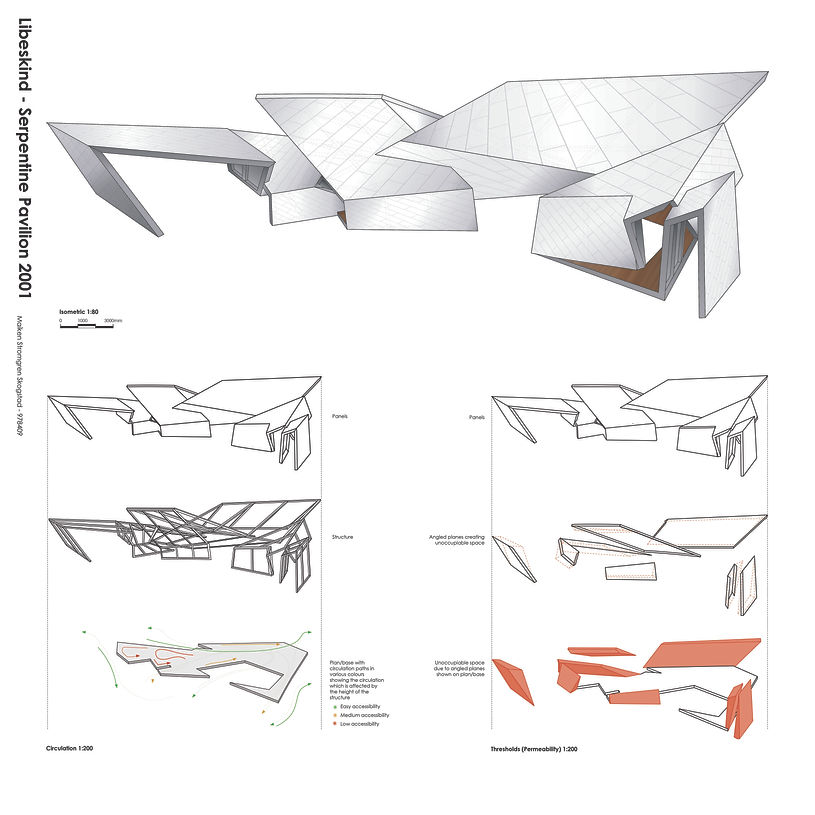
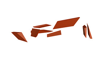
Libeskind Serpentine Pavilion 2001

Source: Serpentine Galleries. Serpentine Pavilion, 2001, London, United Kingdom. https://libeskind.com/publishing/serpentine-gallery/
Libeskind’s Serpentine Pavilion is essentially a long string of several planes varying in size and angles. The planes are wrapped around each other to create an intricate and impressive pavilion. The most accurate way to design the pavilion in Rhinoceros was to begin with tracing the provided unrolled model, which is also functioning as a plan. The next step in the process was to, as accurately as possible, rotate the various planes with the Rotate3D-command. Finally, the planes were extruded and given volume to resemble the actual pavilion.
Design Process in Rhino
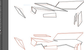
The process progressed with the rotation of the many different planes. The 'Rotate3D'-command was used and the planes were carefully rotated and tweeked to become the intricate pavilion Libeskind designed.
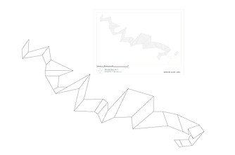
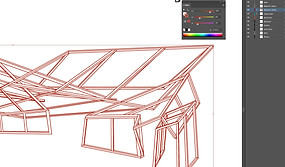
The provided picture of the unrolled model was placed in Rhino and arranged layers to be able to trace the plan accurately. All the lines were traced so that all the planes, with their various shapes and angles, were individual objects before finally extruding.

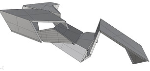
Finally, the planes were designed, extruded and rotated, as well as having been given volume.
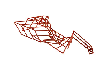
Structure was built to demonstrate a possible way the pavilion can be supported.

By carefully manoeuvering around the 3D-model in Rhino and assessing the angled planes, figures were created to repesent the unoccupiable space of the pavilion.
Figures showing unoccupiable space.
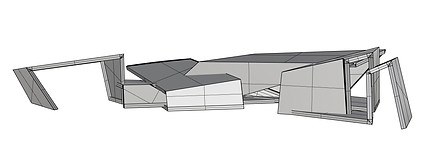
Perspective of modelled pavilion in Rhinoceros.
The elevation of the pavilion has been checked with the given documentation to assess and make sure they complement each other.


Plan of modelled pavilion in Rhinoceros.
Adjusting lineweights and adding texture
in Illustrator and Photoshop
Illustrator was used to adjust the lineweights of the design according to their importance and towards the goal of the final representation.
Adjusting lineweights and colours of the diagrams, for instance adding hatched lines to represent spaces.

Adding texture and detailed panels onto the planes in Photoshop.
Additionally, adding texture to the flooring of the pavilion to complete the representation.

Final Isometric
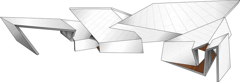
My isometric is taken from an angle that shows some of the most intricate corners of the pavilion and the rotations of the different planes. It shows both a piece of the flooring with the texture as well as the tiling-like detailing on the panels. This pavilion has been very educative regarding the complexity of a serpentine pavilion due to the way it is wrapped around itself multiple times and consequently forms a structure for occupiable space. The circulation and threshold diagrams assisted me in the understanding of the natural flow both inside and outside the structure, when it comes to occupiable and unoccupiable space. The roofing planes vary greatly in height and therefore, accessibility varies as a consequence. Certain areas may have a decent height where one can move around freely in a natural pattern versus other areas where one might have to bend down slightly to access it properly.
Circulation Diagram
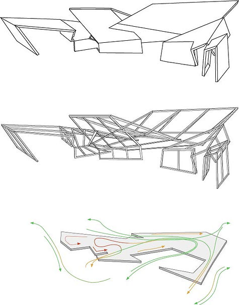
The circulation diagram shows the isometric divided into three layers. The top layer shows the panels and their shape, the middle layer shows the structure of the pavilion and how it is built, while the bottom layer shows the plan/base with circulation paths in various colours. The circulation paths, shown by the use of arrows, demonstrate the circulation which is affected by the height of the structure. Green symbolising easy accessibility, orange symbolising medium accessibility and lastly, red showing low accessibility.
Threshold Diagram
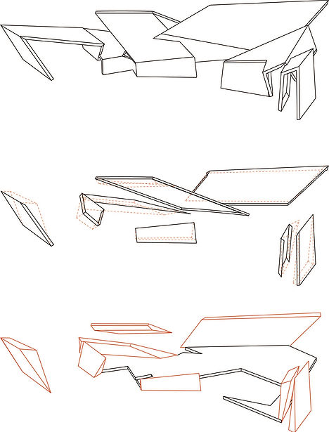
The threshold diagram is also divided into three layers and the purpose with this diagram is to demonstrate how the angles of the planes affect what space is occupiable or not. The top layer shows the panels, while the middle layer shows the panels, functioning as walls, that because of their angles, create unoccupiable space. The bottom layer displays those particular unoccupiable spaces as figures.
Final Representation of Module